
I'm the Lead UX/Game Designer for Black Throne, DraftKings' internal casino games studio. I lead UX across the studio's game portfolio, owning projects end-to-end from initial concept and UX systems through engine implementation, testing, and final polish. I directly manage one designer who works on UX for new games and develops prototypes, while also mentoring the other designers on my team across UX and game design. I work closely with art, engineering, and product to turn game concepts into polished, production-ready experiences.
I've contributed to 50+ shipped titles across the portfolio, with involvement ranging from UX strategy, wireframing, and layout design to hands-on Unity implementation and technical design.
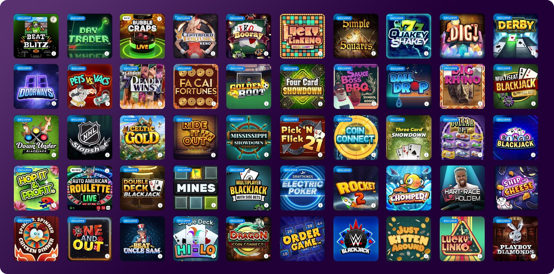
I mentor UX designers and external partners, reviewing usability and player-habit research to keep design decisions grounded in how people actually play. I've defined the UX guidelines and pattern library our internal team and external developers build every casino game against, and I partner directly with product managers and engineers to shape the tooling and workflows the studio uses to ship faster without losing visual consistency. The projects below go deeper into that process, followed by the internal component system I built to scale it across the team.
I design feedback and visual hierarchy so players can understand game state without having to stop and interpret the interface.
I use prototypes, animatics, and shared design systems to bring art, engineering, and product into the conversation early, so we can iterate quickly and often before moving to full implementation.
I use usability and perception testing to challenge assumptions and refine pacing, layouts, and interactions based on how players actually respond.
I create reusable components, patterns, and tools that let teams move faster while maintaining consistency across a growing game portfolio.
How do you make a multiplayer poker experience readable and engaging on a mobile portrait screen when up to nine players may be competing simultaneously?
Electric Poker was a long cross-functional effort across many teams at DraftKings and our first multiplayer online game. The games team owned all front-end design and art. We originally scoped an up-to-9-player game with a much larger feature set, a genuinely difficult test of maximizing screen space for a mobile-portrait-first experience with that many simultaneous seats.
Due to project timelines and scope, we reduced the experience to a “last man standing” tournament format: 3-player tournaments with ranging grand prizes. The “Electric” theming comes from the pace: each round has a time limit, and once the timer runs out, remaining players are forced all-in until opponents are knocked out. It was a difficult project with multiple pivots and major technical hurdles. We tested the designs directly with potential customers, specifically for clarity, usability, and whether the experience felt like something they'd want to play or that stood out from other poker products they'd tried. Two of the biggest changes we made came directly out of that testing: adjusting the pace of play, and redesigning how player seats looked and were placed at the table.
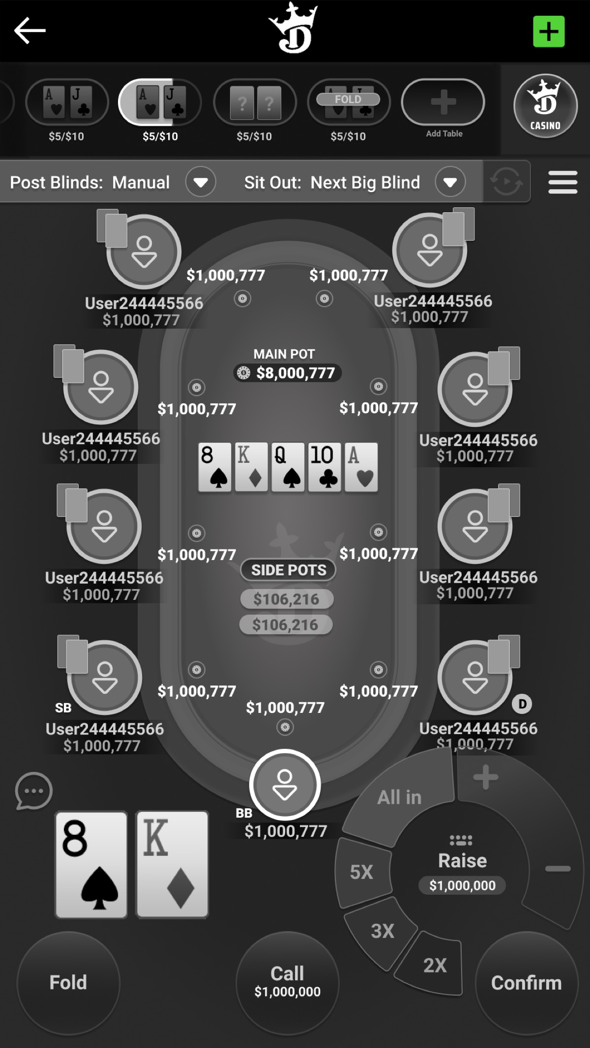
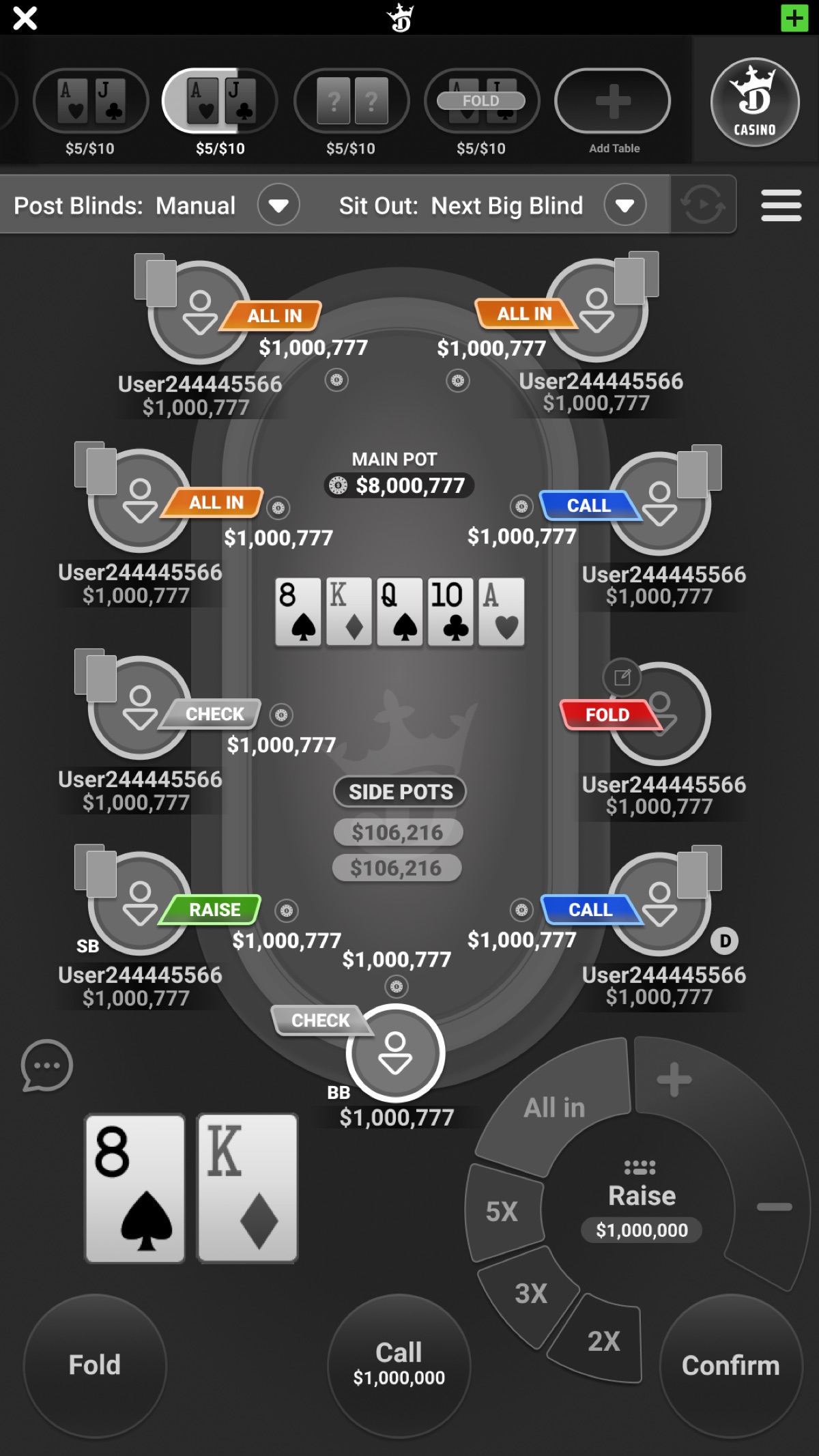
Wireframes from the original larger-scope 9-player experience, testing table layout and player-action feedback (fold / check / call / raise / all in) before the format was reduced to a 3-player tournament.
Shipped Electric Poker experience.
Chomped runs on a live, server-driven backend, so player actions, animation, FX, and the server-confirmed outcome don't always land at the same moment. The challenge was keeping the experience feeling responsive and cohesive within that gap.
Chomped is a new game similar to our most popular title, Rocket: players bet on up to 5 fish being chased by sharks, with the stake multiplying the longer they stay in. Wait too long to cash out and the fish gets Chomped, losing both winnings and stake. It's a translation of the Rocket mechanic into 3D, one of only a few fully 3D games in our portfolio, and another heavy cross-functional effort between art, design, and engineering to sequence the experience and find the pain points.
Mobile UI was one of the bigger challenges. There's a lot happening on screen at once, so we built a sub-menu system to move less-frequently-used options (like auto play settings) out of the primary view, then iterated on sizing for usability and tested it. We also hit implementation friction trying to replicate our artists' stylized concept text using UIToolkit, which needed some custom technical solutions to stay accurate to the original concepts.
As with Dig!, we adjusted animation sequencing and the “chomped” event choreography so outcomes read clearly as a win or a loss. I personally led that effort, adding lane highlighting for wins versus losses and directing distinct animations for a chomp versus an escape. Because the outcome comes from the server, a lot of that work was figuring out which parts of the animation could start on the player's action and which parts had to wait on a confirmed result.
Cash Out Game Flow
The shark stays down.
The shark resurfaces to play the chomp.
The dive plays the moment the player cashes out: the fish goes under with a water splash FX as the shark dives, and the server-confirmed result decides afterward whether the shark resurfaces for the chomp.
If the connection drops outright rather than just lagging, the game falls back to our standard graceful-close procedure: the player sees a lost-connection message, and if the round was left in a broken state, they can still view the outcome afterward in their round history.
Water Shader. Wrote and parameterized the game’s water shader in collaboration with the art lead, exposing tunable controls, including depth, murkiness, and shoreline foam among others, so the art team could tune and refine it without editing code.
Working through Chomped reinforced how much animation sequencing and FX timing shape whether a live, server-driven game feels responsive, not just how it looks.
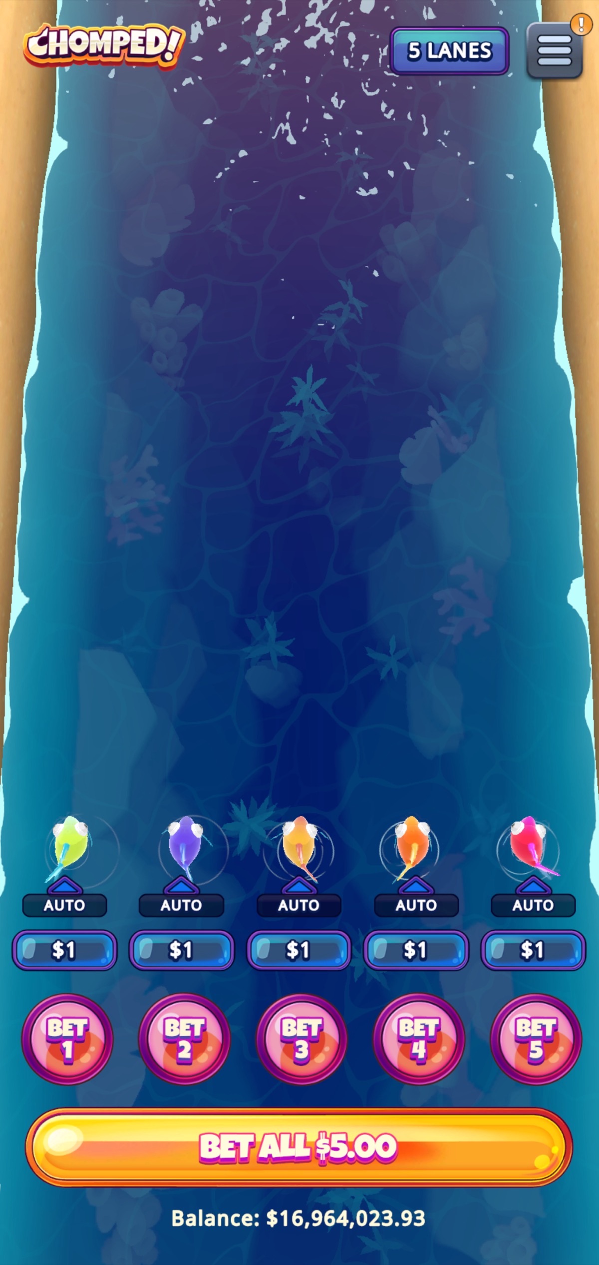
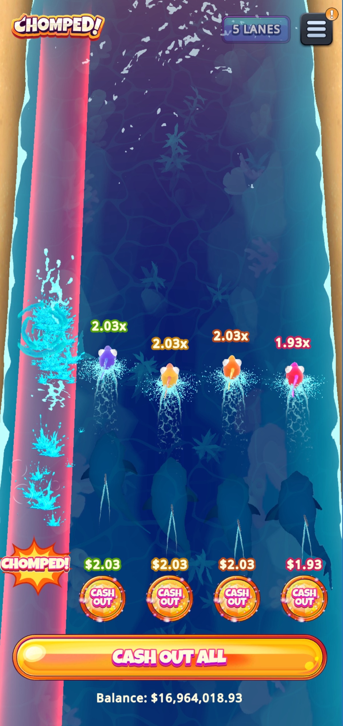
Internal test build: bet screen, a live round with a chomp event in progress, and gameplay capture.
Players felt they weren’t winning in the early levels and couldn’t see how much more the later levels paid, so nothing pulled them forward.
Dig! was our first in-house arcade-style game: players dig down to uncover gems that equate to prizes, choosing to cash out along the way or risk it all for a shot at the final level and maximum prize. The main development hurdle was continuous choreography of character and environment sequencing as the player progressed.
We also had to revisit the opening sequence. Internal testing showed players felt like they weren't winning during the earlier levels and had no sense that the later levels held significantly more reward potential, yet the stakes at the final level were understated, so there was nothing pulling players to keep going. I personally led the effort to fix this: we storyboarded a new starting sequence that highlights the levels and clearly states the grand prize, and I animated it in Figma to show stakeholders, then helped implement it in collaboration with artists and engineers. It was a collaborative effort, and we set everything up in Unity, then exported the game for the Mezzanine engine, where I made layout and transition adjustments to the hard-coded game scripts. It was one of the last titles we shipped on it.
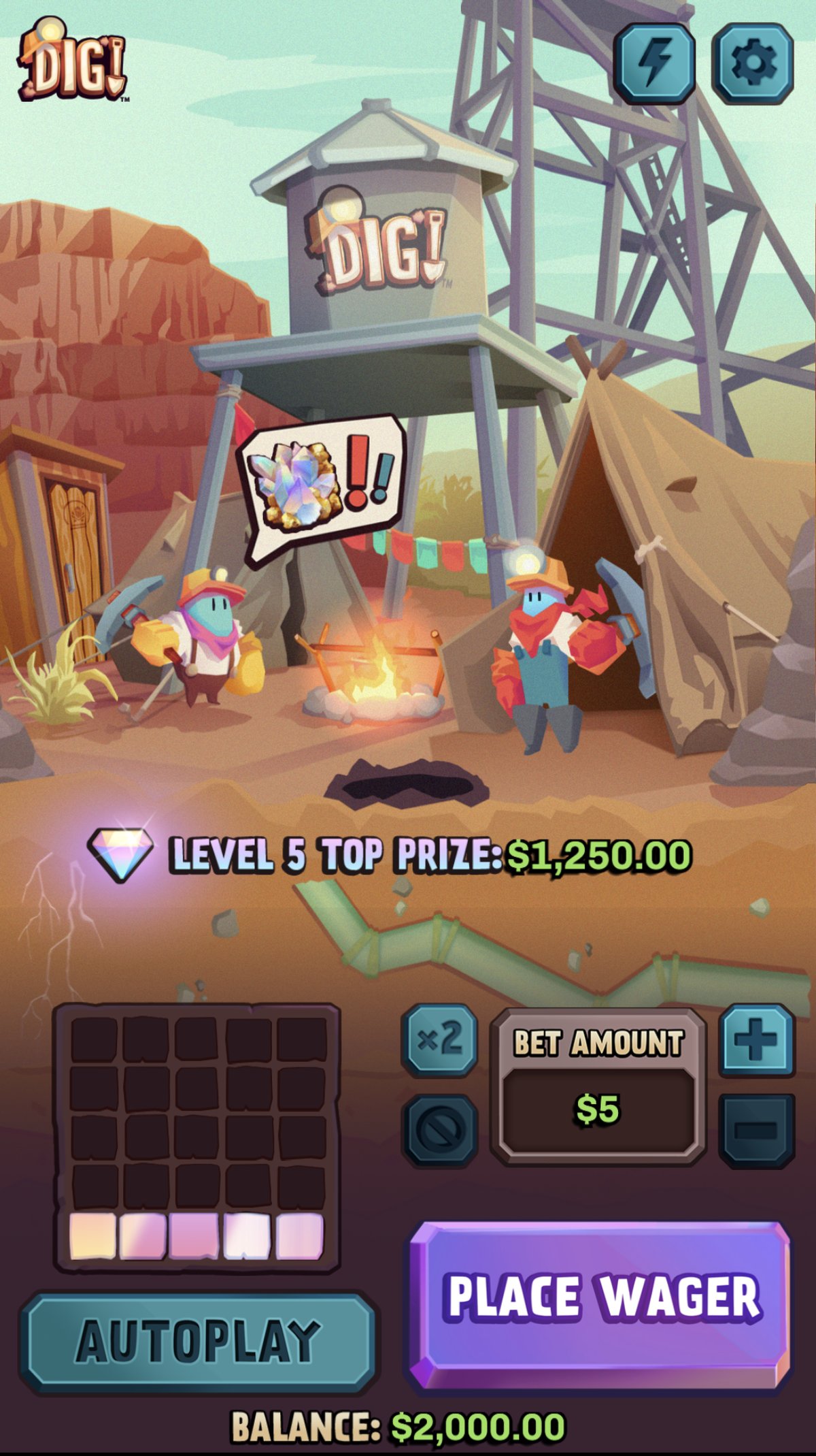
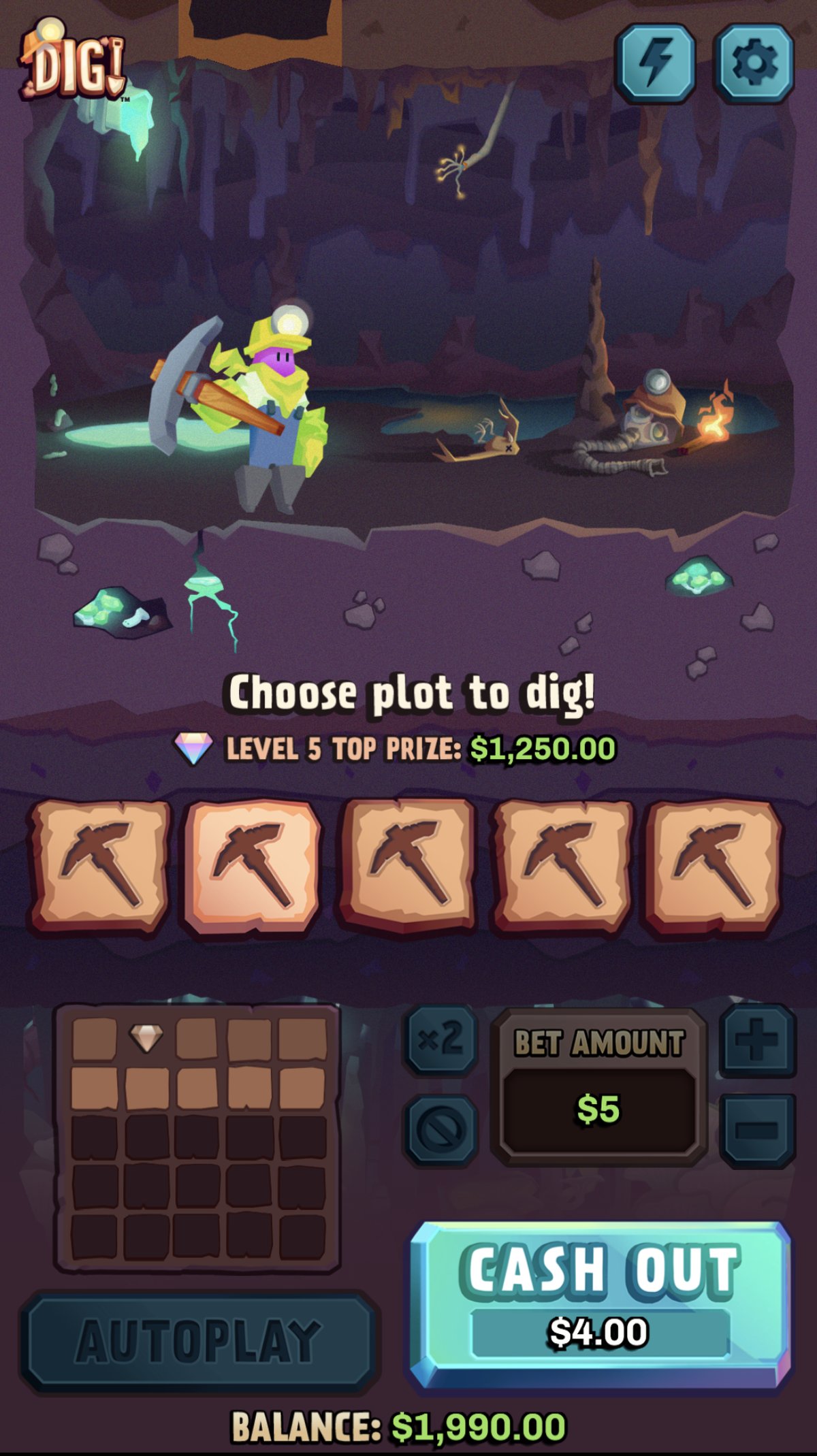
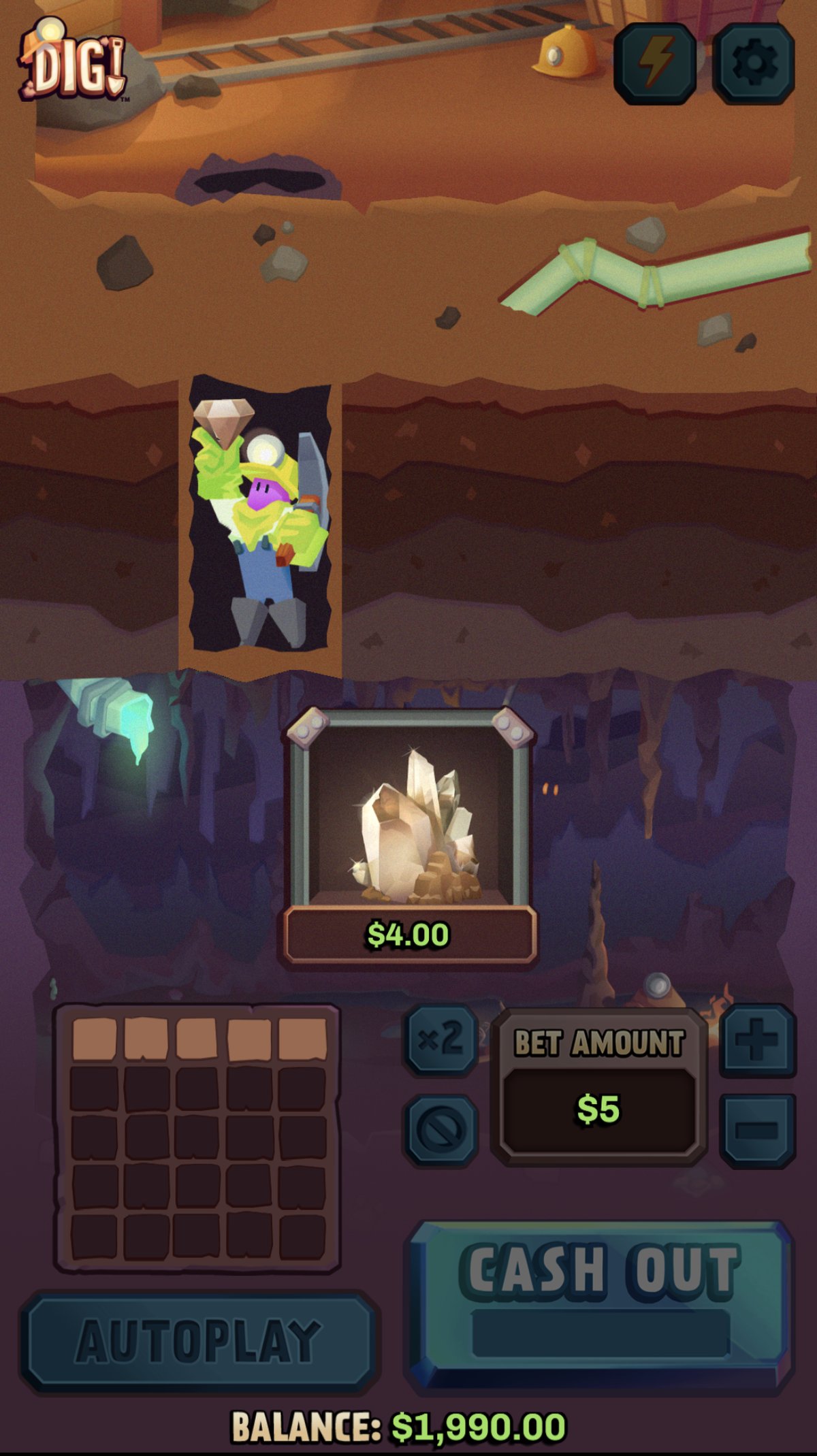
Shipped Dig! UI, including the revised opening sequence that surfaces the final-level grand prize.
Players couldn’t distinguish between decorative star ratings and stars that contributed to the collection reset.
We reframed the tracker as “Bad Reviews,” added thumbs-down feedback for 1-star results, and introduced a “Sold Out” state to clearly communicate when a collection reached its maximum tier.
Sauce Boss was built to drive our slot portfolio expansion. Slots are the most popular driver of online casino play, and we needed to compete on variety and quality. It was our second in-house slot title, and it introduced a new collection mechanic: players collect and upgrade symbols to unlock bigger wins. The design challenge was fitting all of that collection state onto the screen in a way that fit the theme and actually made sense to the player.
Players collected a range of food symbols, and once a collection was fully “sold out,” the symbol upgraded to a higher-value food item. Star symbols ran as a separate system on the reels: three 1-star reviews triggered a negative reset of the collection, and 1–5 star ratings were mixed in alongside them. Early testing showed players couldn’t tell which stars were cosmetic and which were tracking against that reset, so they didn’t understand what they were actually collecting. We went through many iterations and, based on that testing, rebranded the tracker as “Bad Reviews,” with a thumbs-down sticker added each time a 1-star symbol landed, so the reset condition read clearly at a glance.
We also came up with the “Sold Out” idea for when a symbol collection hits its max tier: the UI shows “Sold Out” and draws an arrow pointing up to the higher-value food symbol it upgrades into. This feedback also reinforced the food-truck theming.
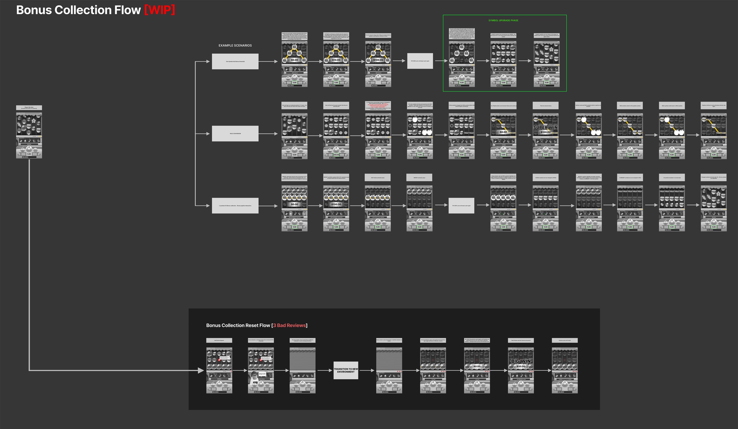
Bonus collection flow I mapped out before implementation, covering every collection scenario, the symbol upgrade phase, and the 3-bad-reviews reset branch.
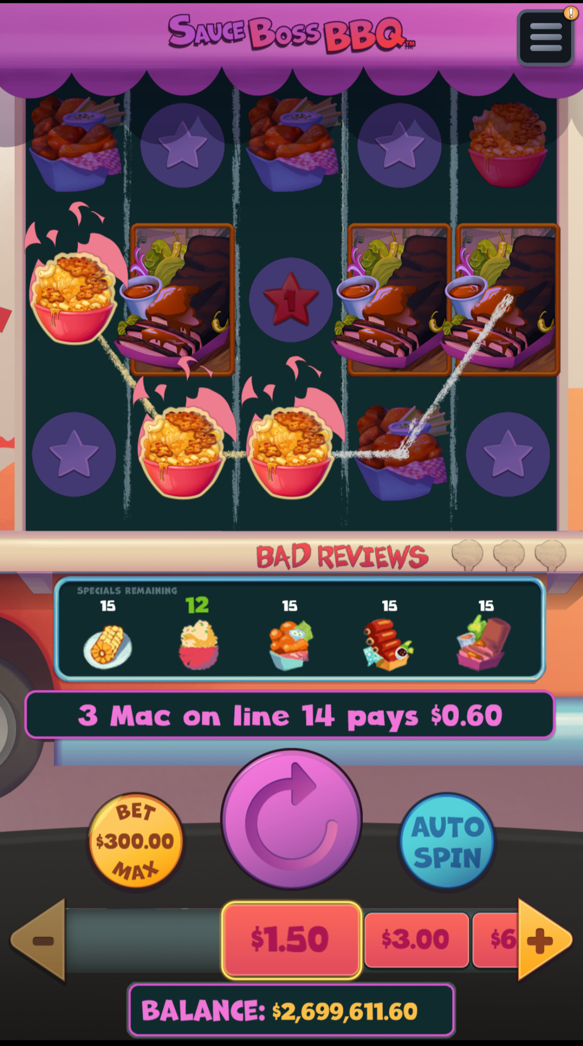
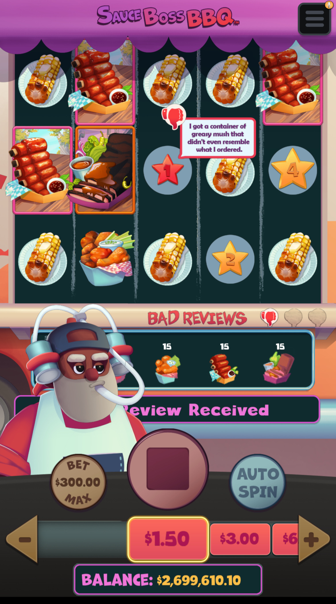
Shipped UI with the redesigned rating/collection system.
How do you let a growing team start each new game from a consistent foundation instead of rebuilding the same UI every time?
As the studio grew, I built reusable design systems and Unity tooling that allow new games to start from an established foundation rather than from scratch.
Alongside shipping individual titles, I built out a library of reusable UI components in Figma: betting controls, screen-space guidelines for portrait and landscape, auto play controls, win celebration and messaging, game recovery flow, and options/toolbar patterns, which our art team then produced and engineering implemented as a template Unity project. Every new game on the team now starts from that template instead of from scratch.
The recovery flow specifically defines what a player sees if they return to a game after a connection drop or other failure. Depending on the game and where it left off, that can mean resuming an in-progress animation, returning to a static state, or, for live games where the moment has already passed, a message explaining the round's outcome or any events they missed.
For our chip-based games, I custom-scripted a highly configurable chip selector component, driven by UIToolkit, with both 2D and 3D versions. I set up the parameters and guides myself: chip counts, animation curves, fan-out spacing, selection scale, so non-developers (artists, producers, stakeholders) can tune the look and feel directly instead of requiring an engineering change for every visual tweak.
This system has had a tremendous impact on how quickly we can start a new game, and on getting stakeholders aligned on look and feel early in the process. It's also the same set of guidelines I use to mentor other UX designers and align external development partners on our UX patterns.
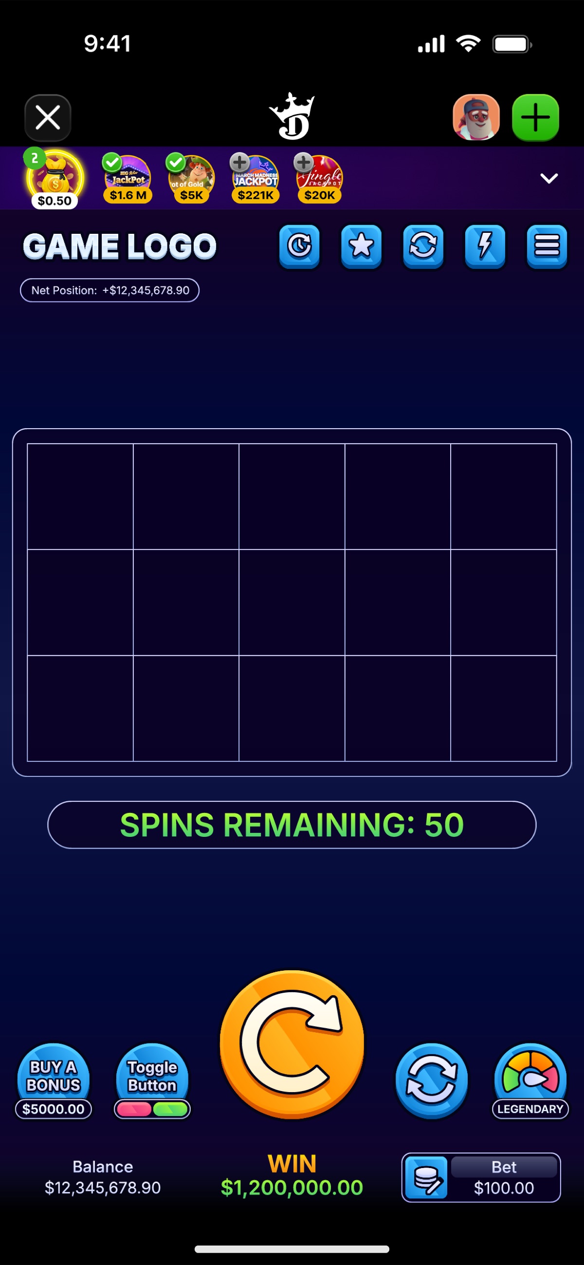
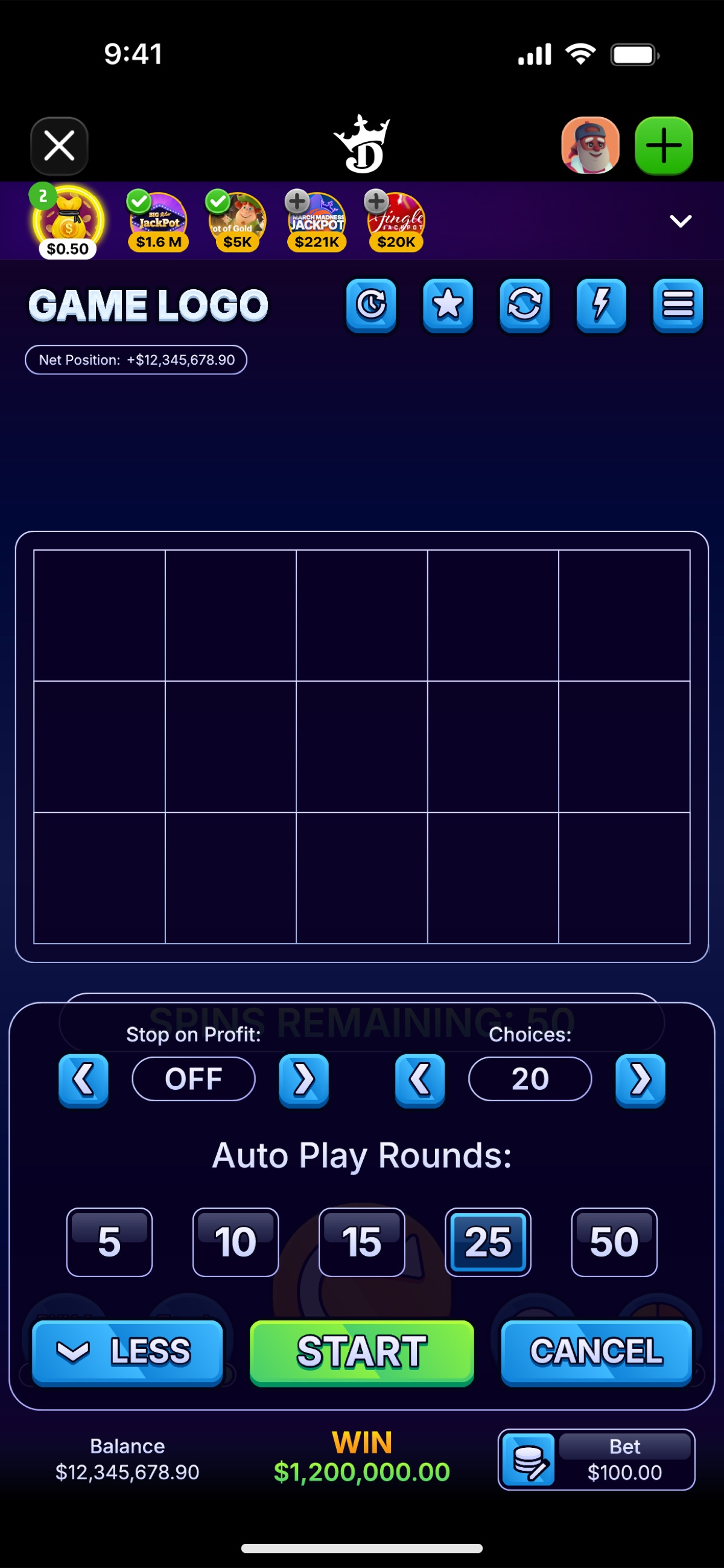
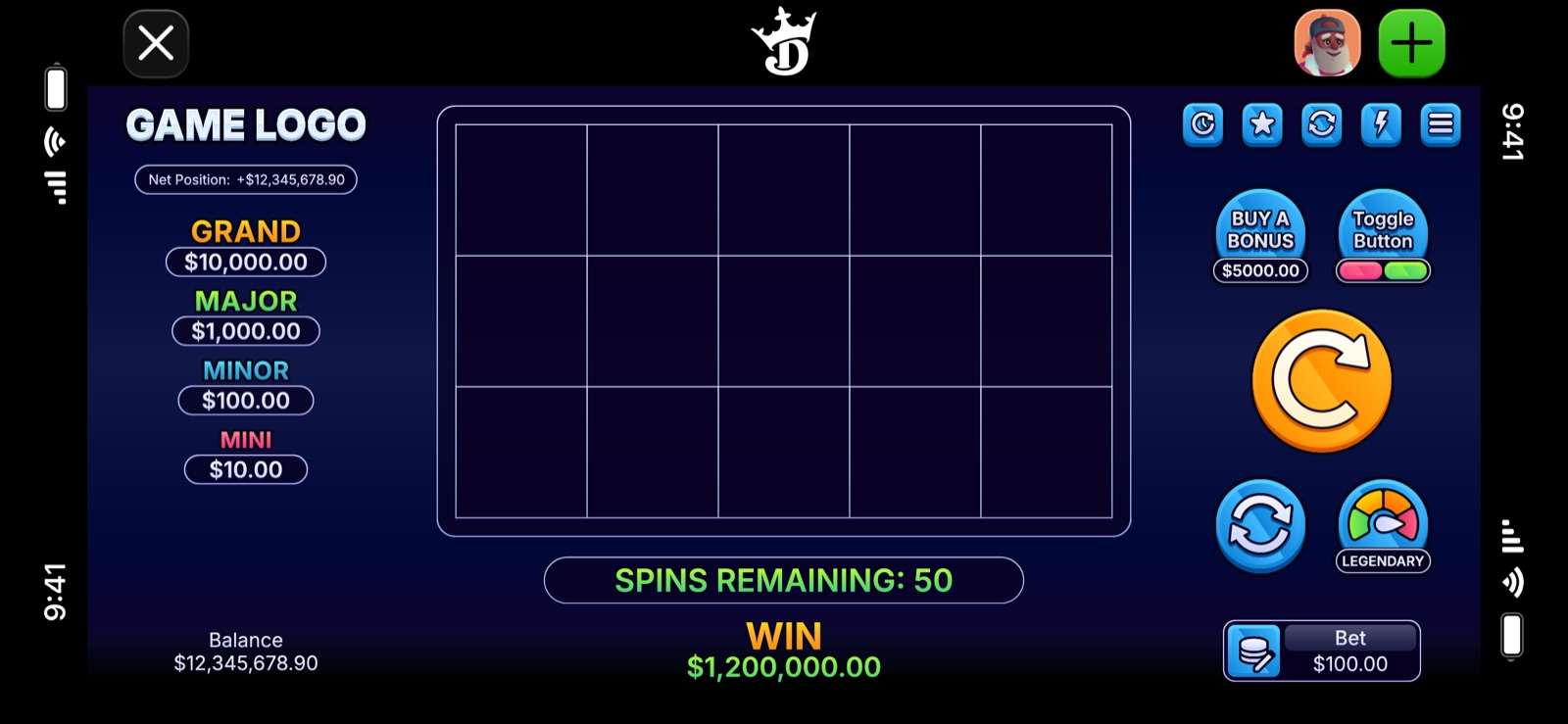
The reusable Unity template project in portrait (base state and auto play sub-menu) and landscape orientation.
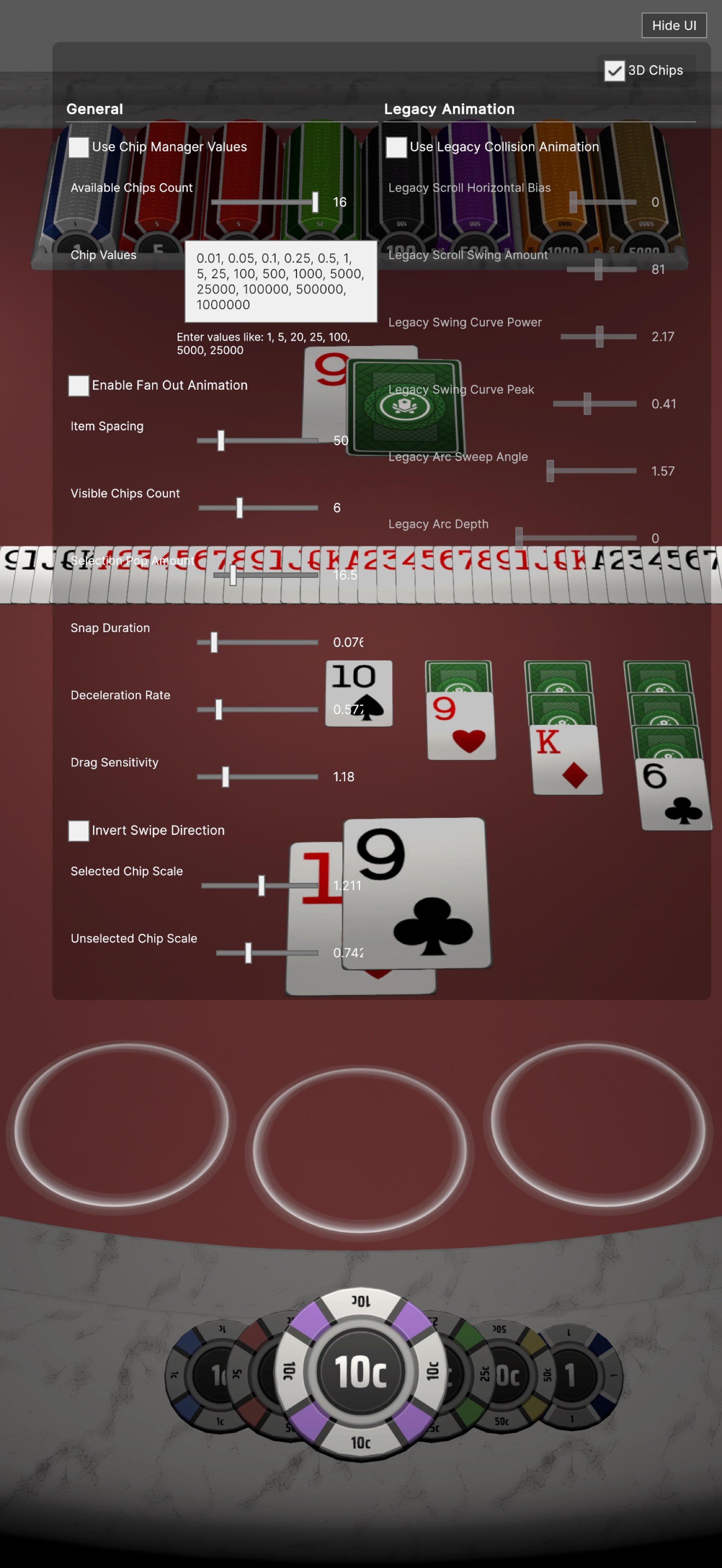
The configurable chip selector tool: every parameter exposed for non-developers to tune directly.